Brief For A Busy Hotel Front Entrance
The client was a guest-focused venue in Benoni that wanted new entrance lettering for the main public face of the building. The brief was practical: improve visibility, keep the look smart after dark, and make sure the lettering matched the entrance proportions without crowding the fascia.
As with many hospitality sites, there was pressure to work around trading hours, delivery access, and guest movement in the driveway. The entrance already carried other visual elements, so the new letters had to sit neatly in the available width and still be readable from the street. The hotel team also wanted a finish that would stay tidy in summer rain, dust and daily cleaning.
- Location: Benoni, Gauteng
- Client type: Hospitality entrance
- Use: Main entry identification and wayfinding
- Focus: Daytime clarity and night visibility
Measurements, Letter Form And Material Choice
We started with site measurements and checked the viewing distance from the entrance lane and parking side. That helped us set the letter height, stroke depth and spacing so the sign could be read quickly by arriving guests. The final layout used individual formed letters rather than a flat panel, which gave the frontage more depth and a cleaner shadow line.
The letters were bent from coated aluminium returns with opaque faces, built for consistent edge detail and tidy joins. The size was chosen to suit the fascia span, with enough face area for clear visibility without overpowering the entrance. The finish was selected for low-maintenance cleaning and to keep its appearance under strong Highveld sun.
- Form: Individual channel letters
- Return depth: Sized for strong visibility at entrance level
- Face finish: Opaque for day and night contrast
- Mounting: Fixed to suit the existing fascia structure
Benoni Hotel Entry Returns, Coils And Build
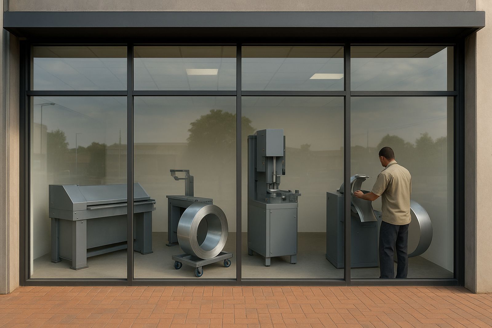
We supplied the full lettering set, formed to the agreed layout and prepared for straightforward on-site fixing. The production process included bending, trimming, face preparation and final checks on shape consistency. This matters on hospitality work because even a small variation in letter alignment can show up very quickly once the lights are on.
Channel letters were produced to keep the outer edges neat and to give the sign a firmer profile than a flat print. That also helps in environments where the entrance gets regular attention from cleaning staff and security teams. Each piece was packed and labelled for fast installation, which reduced handling time on site and kept the team moving even with limited access windows.
- Supplied set: Full entrance wordmark
- Build style: Bent returns with fitted faces
- Finish checks: Alignment, edge quality and consistency
- Packing: Labelled for quick installation sequence
Onsite Fitment Around Hotel Operations
The installation was planned in a way that kept disruption low. We scheduled the work around guest arrivals and departure periods, and allowed for the usual site limits that come with hotels, including parking control, safety cones and clear access for other vehicles. The fitting team confirmed levels on site, then fixed the lettering in sections to keep the line straight across the fascia.
Because hotel entrances can be sensitive spaces, the crew worked carefully around glass, lighting points and existing hardware. We also checked for practical issues like cable routes and fixing depth before final securing. In Midrand and Benoni type sites alike, this kind of prep saves time, especially when load-shedding or municipal interruptions can shorten the useful working window. The install was completed in under one week on site, with the full project running to a 2 week schedule from sign-off to handover.
- Site planning: After-hours friendly where needed
- Install approach: Sectional fixing and level checking
- Timeline: 2 weeks from approval to completion
- Working note: Extra care around access and safety zones
Results At The Front Door
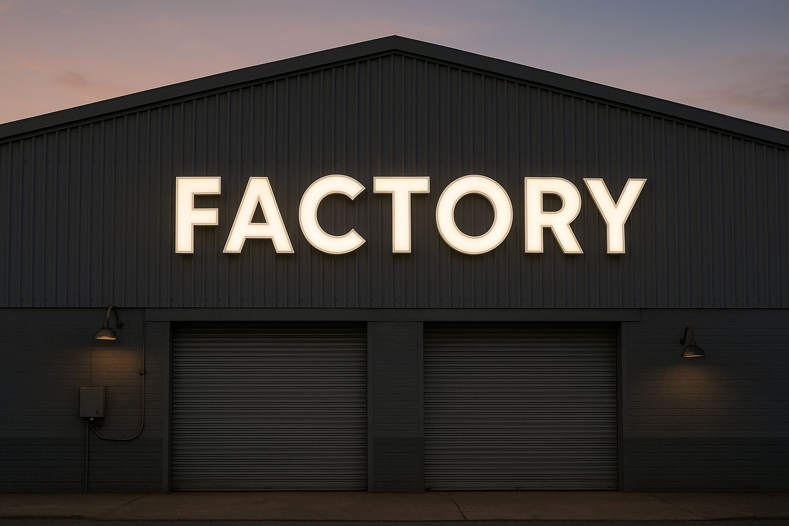
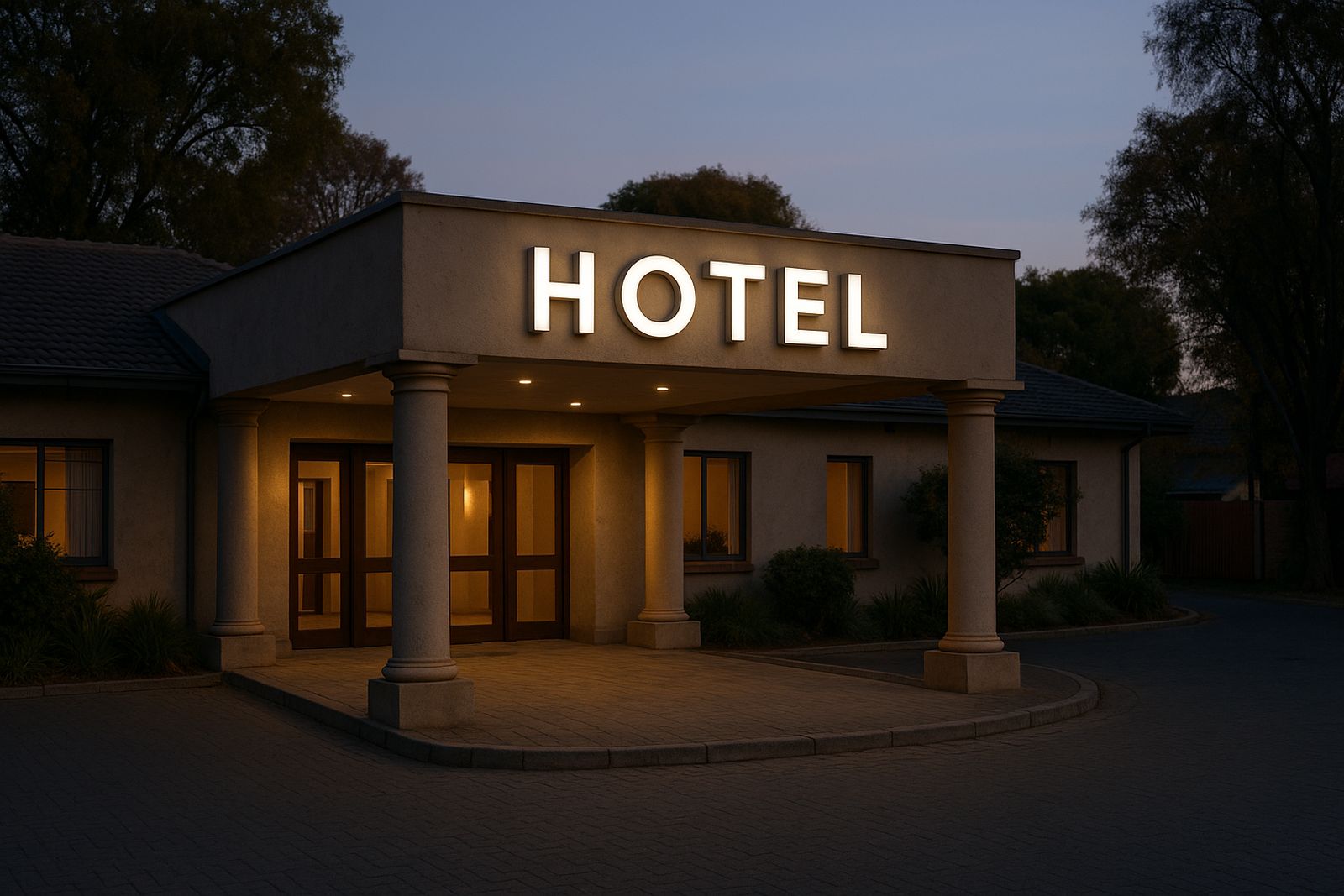
The finished lettering gave the entrance a clearer identity and improved recognition from the road and driveway. At night, the sign reads well without looking harsh, which is important for a guest venue that wants a welcoming feel rather than a factory look. The hotel team also wanted something that would not date quickly, and the formed letters suited that aim.
From a maintenance point of view, the client now has a cleaner sign face that is easier to keep dust-free. The solid build also helps in Gauteng conditions where heat, summer storms and occasional dust can affect cheaper materials. The result is a front entry that looks considered, tidy and practical for day-to-day use.
- Improved road-facing visibility
- Clearer guest arrival point
- Smart look for a hospitality setting
- Easier upkeep than printed frontage graphics
What We Would Repeat On Another Hotel Job
For this kind of project, we would repeat the same process: measure properly, confirm sightlines early, and build in a little extra time for site coordination. That approach works well on hotels, lodges and conference venues where the front entrance has to keep working while the sign is being installed.
We would also keep the same focus on material selection and serviceability. In coastal areas like Durban we might spec a different protective finish, while inland sites can often take a simpler build. The key is matching the sign to the place, the traffic and the upkeep routine. That way the client gets a result that stays presentable and not just something that looks good on day one.
- Best practice: Confirm access, dimensions and sightlines first
- Service factor: Choose materials for the local climate
- Hospitality rule: Keep disruption low and the frontage usable
Key facts
| Project | Benoni Hotel Entry |
|---|---|
| Town | Benoni, Gauteng |
| Sector | Hospitality entrance lettering |
| Product | Formed channel letters |
| Timeline | 2 weeks from approval to handover |
| Scope | Supply, planning and onsite fitment support |