
A showroom brief that had to look right from the first glance
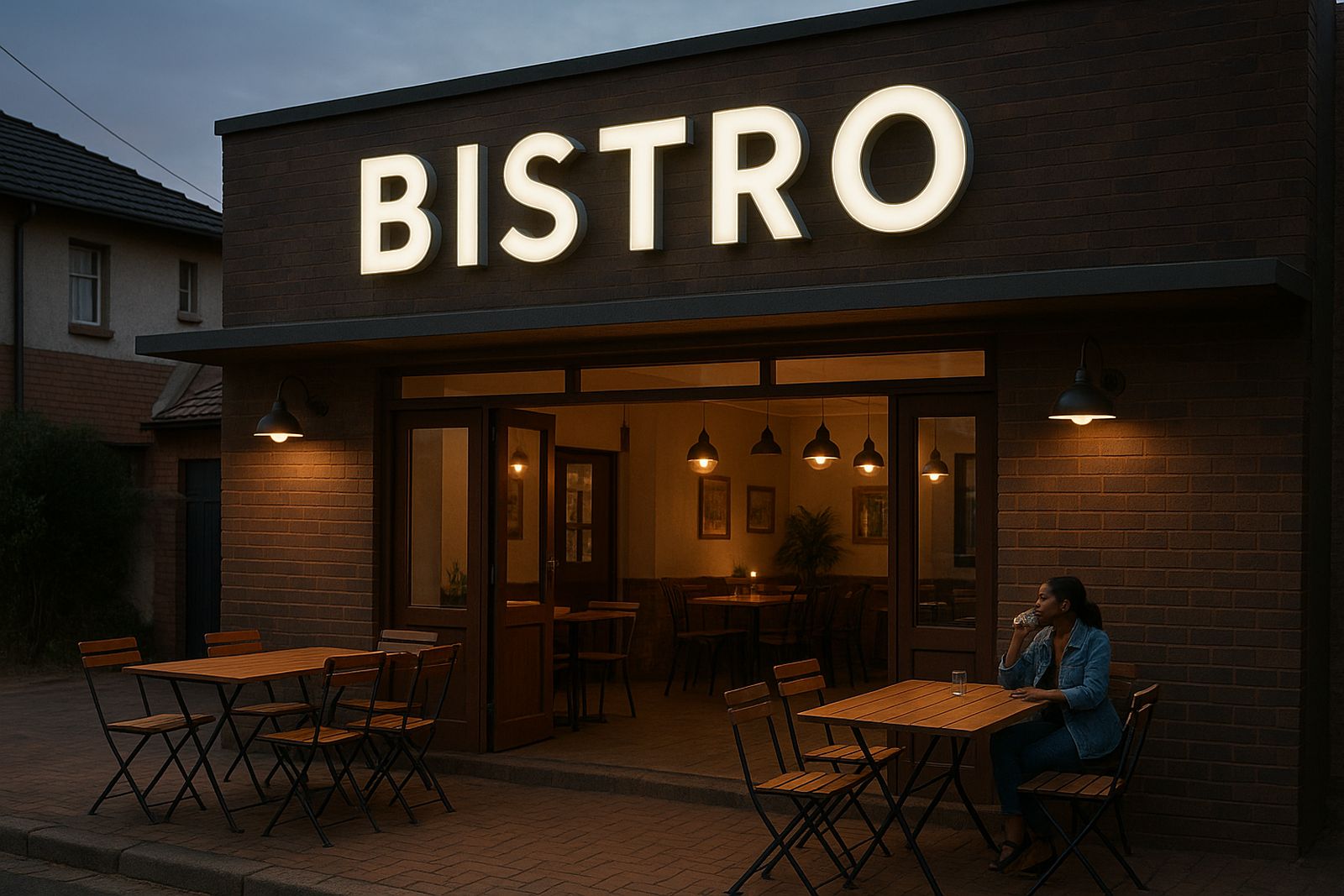
The client was a customer-facing showroom in Pretoria East, serving walk-in buyers and regular trade visitors throughout the week. The brief was straightforward on paper but exacting in practice: create premium storefront lettering that matched the business front, stayed legible in bright daylight, and gave the entrance a proper finished look without drawing attention to fixings or joints.
This was not a factory yard or a back-of-house sign. The signage had to work at eye level, at street distance and under the type of mixed lighting common in commercial nodes around Pretoria East. The client wanted a sign that looked neat at close range too, because people would stand right in front of it when entering the showroom.
The main concern was durability. Pretoria gets hot summer sun, dusty winds and heavy afternoon storms, so the lettering needed proper structure and material choice. It also had to sit correctly against the facade, with even spacing and a clean edge line, because the frontage is part of the brand impression before a sales conversation even starts.
Site conditions, measurements and the constraints we planned around
The site had limited working space at the front entrance and controlled access during business hours. That meant we had to plan the job around customer movement, parking flow and the client’s trading times. We also checked for wall condition, fixing points, power access and exact clearances before any production work started.
- Location: Pretoria East showroom frontage
- Access: customer-facing entrance with limited offloading space
- Exposure: direct sun, dust and seasonal rain
- Mounting surface: prepared exterior wall section with measured set-out lines
- Visibility need: readable from the driveway and from close inspection
Because the frontage formed part of a busy retail strip, we kept the install plan tidy and brief. No one wanted an all-day interruption or repeated return visits. The work also had to take into account municipal style expectations for neat exterior finishes in a business area, so the final result needed to look ordered and well aligned, not overdone.
What we supplied for the Pretoria East installation
We supplied a premium channel-letter style storefront lettering set with matched returns, clean face finish and correctly sized depth for strong side visibility. The set was built for a showroom facade, not a temporary campaign sign, so the detailing focused on long-term presentation and serviceability.
Key specifications included letter depths suited to the wall height, consistent spacing between characters, and a finish selected for easy cleaning and strong day-time visibility. We also supplied the supporting materials needed for a stable fit, including fixings, layout aids and installation consumables. The client needed the sign to feel precise, and that came down to the small things such as alignment, repeatability and the way the letters sat off the wall.
- Letter type: individual channel-style storefront lettering
- Mounting: fixed to exterior wall with measured stand-off
- Finish: clean, professional face and return detail
- Use case: customer-facing showroom frontage
- Purpose: high visibility and lasting brand presentation
Installation and commissioning over two weeks
The full job ran across two weeks from final measurements to handover. Week one covered site verification, final layout approval and preparation of the sign components. Week two covered delivery, positioning, fixing and the final checks once the lettering was mounted.
Our install team worked to the agreed sequence so the client could keep trading with minimum interruption. We marked the layout, checked levels twice, then fitted the letters carefully to preserve the spacing across the frontage. Power and finishing details were checked at the same visit. We also made sure the visual balance was right from both sides of the approach road, because a showroom sign can look fine head-on but uneven from an angle if the set-out is rushed.
The client appreciated that the install stayed orderly. The front of the business remained presentable, and the work area was cleared properly at the end of the day. A small adjustment was needed on one section of the set-out, which we corrected on site without delay, and the final result looked crisp.
Results that improved the frontage and customer confidence
The finished lettering gave the showroom a clearer street presence and a more settled, professional look. It now reads well from the road and still looks neat when customers are standing right at the entrance. That matters in a place where first impressions can decide whether someone walks in or keeps driving.
From the client’s side, the main benefit was confidence. The frontage now matches the standard they want for the rest of the business, and the sign does not need constant attention. It is easy to keep clean, it sits properly on the wall and it gives the branch a more complete appearance. In practical terms that means less worry about weather wear, less time on maintenance and better day-to-day presentation.
- Sharper visibility from the road and parking approach
- Cleaner customer-facing presentation at the entrance
- Reduced maintenance compared with weaker exterior sign options
- More consistent brand appearance for visitors and trade clients
What we would repeat on a similar Pretoria East frontage
On a similar job, we would keep the same approach: exact measurement, early site checks and careful planning around trading hours. That is usually what keeps a showroom install calm and accurate. We would also keep the focus on finish quality and spacing, because that is what people notice first on a customer-facing frontage.
For Pretoria East specifically, we would again allow for sun exposure and seasonal weather shifts, and we would leave enough time for a proper sign-off after installation. If the client needs future maintenance, a refresh of the fixings or another frontage upgrade, we would build the next phase around the same practical steps. A sign should not just look good on day one, it should keep doing its job month after month.
For showroom clients across Pretoria, Midrand, Sandton and the East Rand, this is the kind of project that works best when the installation is treated as part of the customer experience, not just a finishing item.
Key facts
| Project location | Pretoria East |
|---|---|
| Client type | Customer-facing showroom |
| Scope | Premium storefront lettering supply and install |
| Timeline | 2 weeks from measure-up to handover |
| Main challenge | Limited access with active customer traffic |
| Outcome | Cleaner frontage, stronger visibility and durable finish |