
Reception Feature Brief for a Sandton Corporate Office
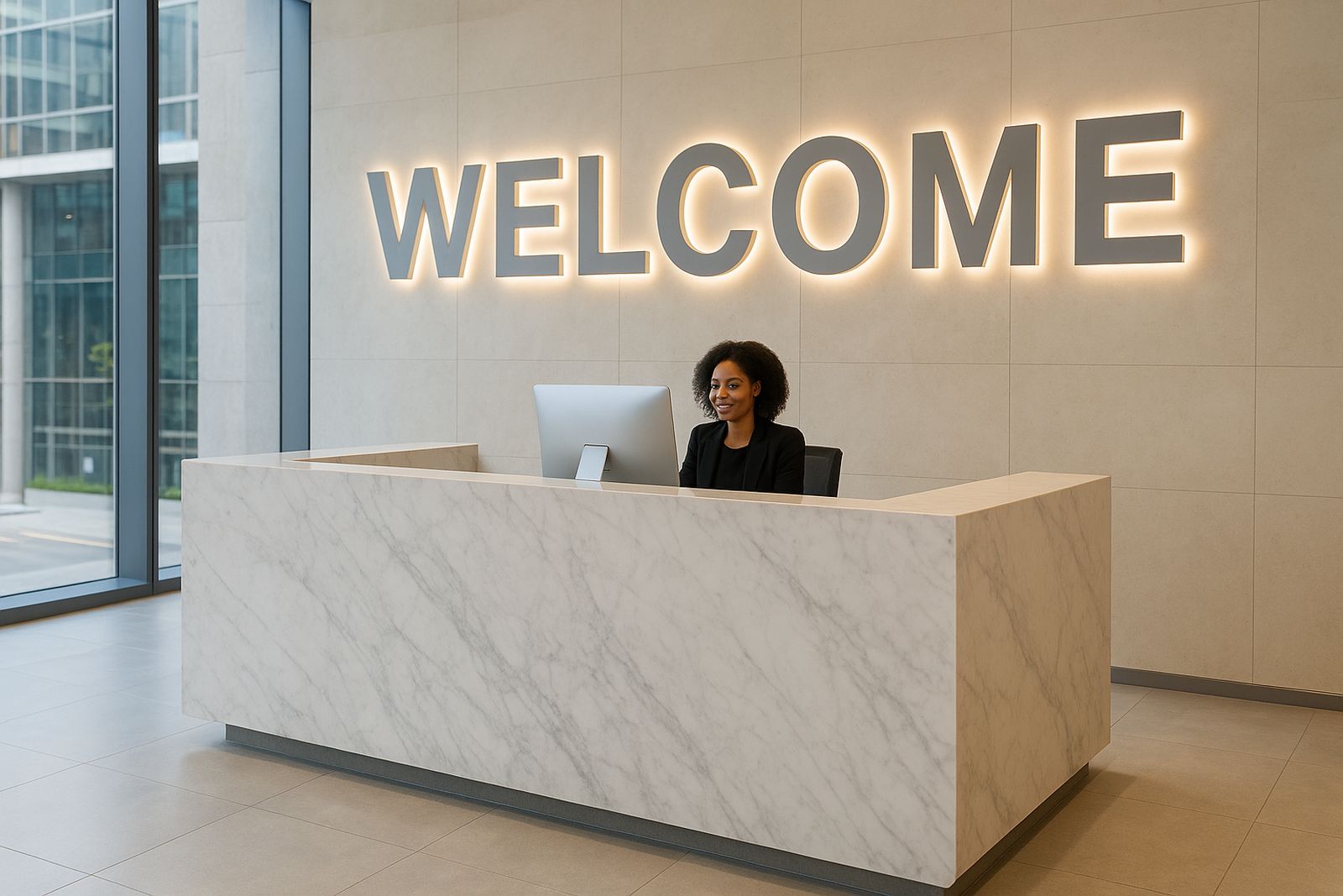
The client was a corporate office in Sandton looking for a reception feature that would feel calm, polished and easy to read from the entrance. The brief was simple on paper but quite exact in practice: the letters had to sit neatly on a feature wall, match the office style, and hold their shape in a busy front-of-house area where staff, visitors and cleaners pass through every day.
Sandton receptions often have tight visual standards. The team wanted something that looked expensive without being fussy, and the signage had to work with glass, painted plaster and internal lighting already in place. We were asked to keep the face finish clean, avoid visible fixings where possible, and make sure the lettering could be installed with minimal disruption during office hours.
Because this was an interior corporate job, the focus was on precision, spacing and a neat edge detail. The brief also had a practical installation side to it.: the wall had to be measured properly, the letters had to be sized for comfortable viewing at reception distance, and the installation needed to be done without leaving dust or patch marks behind.
What We Supplied and How We Matched the Wall
We supplied individually formed interior letters with a smooth face finish and a clean side profile, sized to suit the reception wall width and the viewing angle from the foyer. The set was produced in a corporate style, with lettering heights arranged for clear reading and even visual weight across the full name. The finish was selected to catch light in a soft way, not too glossy and not too flat.
To keep the feature tidy, we worked from verified wall measurements and allowed for small on-site tolerance around corners, joins and painted surface texture. The letters were prepared for direct fixing to the internal wall so the end result would look anchored and permanent, not temporary or stuck on. In a Sandton setting, that detail matters because reception signage gets judged up close.
- Interior corporate letters for a reception wall
- Clean face finish with matching side detail
- Measured to suit the wall span and viewing distance
- Prepared for direct fixing to an internal feature surface
- Made for a polished office environment with daily foot traffic
Constraints We Had to Work Around
The main constraint was the wall itself. It had existing finishes, visible joins and a narrow zone where the letters needed to sit between architectural elements. That meant the spacing had to be adjusted carefully so the line read properly without running too close to corners. We also had to account for the reception lighting, because overhead downlights can create unwanted shadows if the letter depth is not handled properly.
Another issue was timing. The office could not afford a long disruption, so the job needed to be planned for a short install window and handled in one controlled visit where possible. Sandton office buildings can be strict about access, loading bays and lift bookings, so we kept the delivery and fitting sequence tight. A small delay at security can throw a whole morning off, so planning mattered as much as making the letters.
There was also the usual indoor finish requirement: no dust on carpets, no scuffing on painted walls, and no visible mistakes once the reception was handed back to the client. That means careful masking, level setting and final cleaning before sign-off.
- Limited wall space between feature elements
- Existing paint and join lines on the substrate
- Lighting positions that could cast shadows
- Short access window inside a busy office building
- Need for a clean handover with no mess left behind
Installation Planning and On-Site Fitting in Sandton
We planned the fitting in advance, starting with a final check on wall measurements and letter spacing. The installation team then worked to a marked-out line so the feature would sit level across the full width. For reception letters, a few millimetres off on one side is enough to show, so we kept the alignment methodical from the start.
The install was completed in a single planned window over 1 week from final confirmation to handover, with the physical fitting done on site in one visit. That included position marking, fixing, alignment checks and a final clean-down of the area. Once the letters were set, we checked the sight line from the entrance and the main reception counter area to make sure the lettering stayed readable at normal walking pace.
Because the site was in Sandton, we also paid attention to building access rules and parking restrictions. The team arrived with the right fixings, measuring kit and finishing materials so there was no need to stop and fetch parts halfway through. That saves time and keeps the reception staff from dealing with avoidable interruption.
The Result at Reception Level
The finished feature gave the reception area a neat, corporate look that sat comfortably with the rest of the office finish. The letters read clearly from the entrance and held their shape well under the internal lighting. The client wanted something that would feel professional every day, not only when visitors arrived, and the result delivered exactly that.
What stood out most was the calm look of the wall once the letters were in place. There was no clutter, no overdone styling and no awkward gaps. The lettering looked like it belonged to the space from day one. Reception staff reported that the feature made the front area look more organised, and visitors picked out the name quickly without needing to walk right up to the wall.
- Sharper first impression for visitors
- Clear reading from the foyer and reception approach
- Clean wall presentation with no busy visual noise
- Suitable for daily office use and regular cleaning
- Professional finish that matched the Sandton setting
What We Applied on This Reception Lettering Job
On this sort of Sandton reception job, the same approach would be used again: confirm wall measurements early, check the lighting positions before final sizing, and keep the install slot short and controlled. For interior letters, good planning is half the job. If the wall is measured properly and the access is organised, the fitting goes smoothly and the final result is easier to keep neat over time.
We would also keep the client involved at the approval stage, especially where the finish needs to match existing wall colours or office trims. In corporate spaces, tiny differences in spacing, contrast or letter depth can change the whole feel of the room. A practical mock-up or scale check helps avoid that. It saves time and reduces the chance of rework later on.
For future projects, we would still recommend regular cleaning guidance and a quick post-install inspection after the first few weeks. Interior letters usually stay in good condition, but it is worth checking for any movement on the fixing points or dust build-up around the edges. Small checks prevent bigger issues later.
Key facts
| Project type | Interior corporate reception letters |
|---|---|
| Location | Sandton, Gauteng |
| Install timeline | 1 week from final confirmation to handover |
| Application | Reception wall feature for a corporate office |
| Finish | Clean office-grade lettering with neat side detail |
| Support | Measurement, fitting, alignment and site clean-down |