When the reception sign has to look right at 2 metres and 20 metres
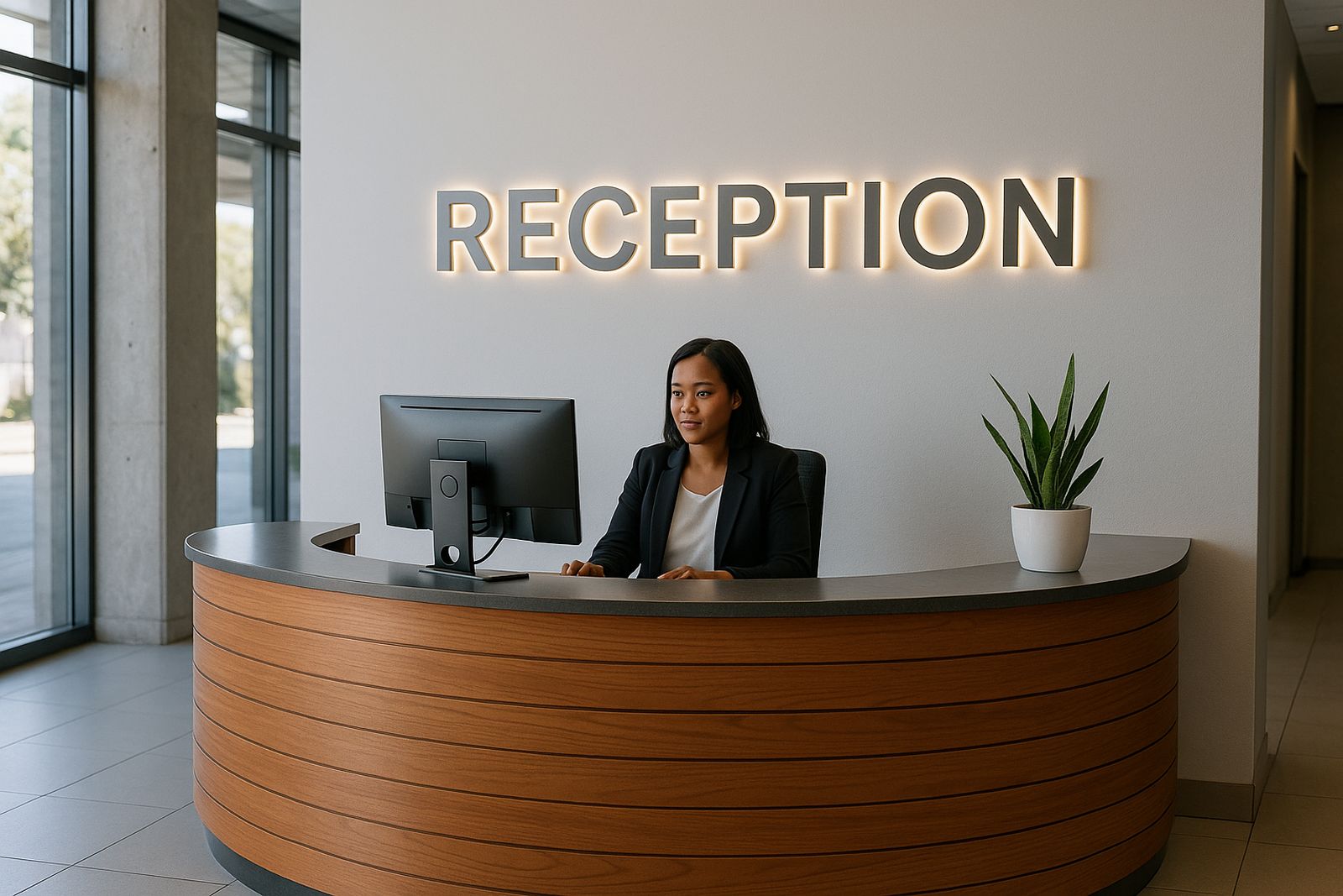
Reception lettering is usually for spaces where people are standing close to the wall, but the sign still has to carry weight from across the room. In Midrand offices, Sandton foyers, Pretoria medical suites and Durban coastal receptions, the brief is often the same: crisp corporate lettering that reads well, looks tidy in photos and does not pick up shadows from the ceiling lights.
For this use case, the profile matters as much as the face. A clean return depth gives the letters body without making them feel heavy, and straight lines around the A, M, N, R and S need to hold their shape. If the reception area has glass walls, polished floors or a feature wall with paint texture, letter edges must be accurate or the whole display looks uneven.
- Common sizes for reception letters: 150 mm to 600 mm high
- Typical return depths: 25 mm, 50 mm or 75 mm depending on the look required
- Most jobs are planned for indoor viewing distances of 1.5 m to 8 m
Typical equipment set for neat corporate lettering
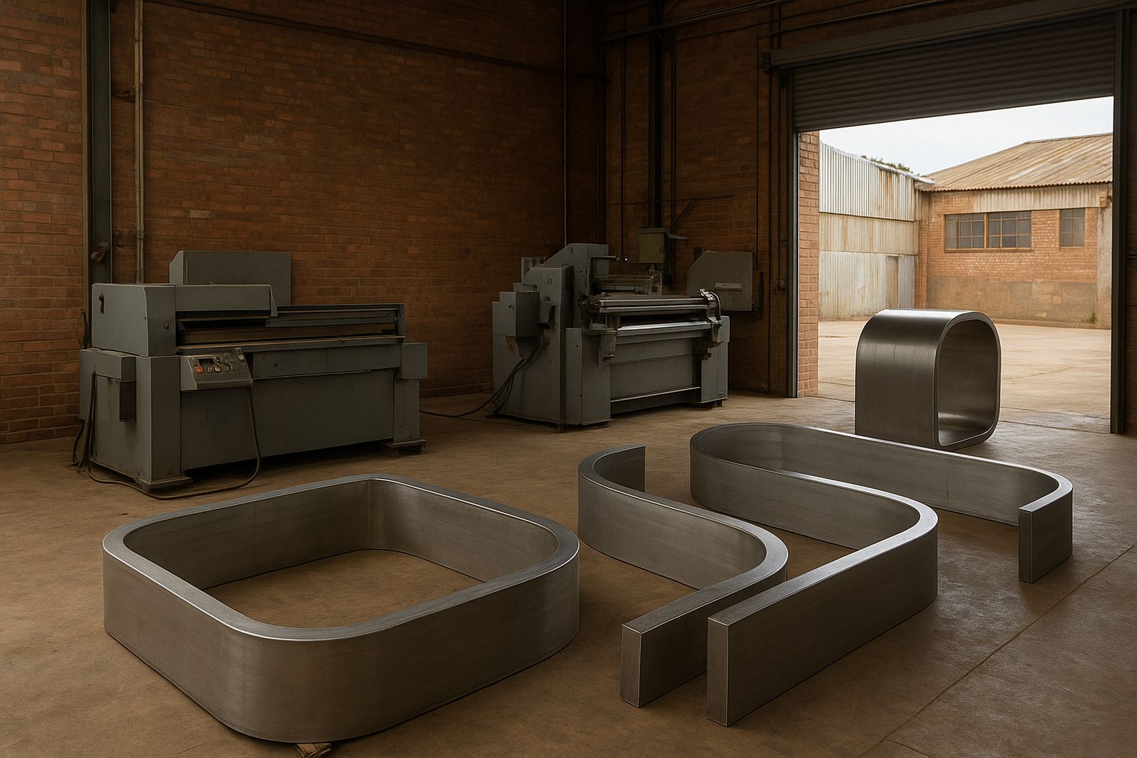
For reception work, sign makers usually want a machine setup that gives consistency on repeated letters and on small production runs. A good bending machine helps with face-return alignment, while the coils and returns need to suit the lettering depth and the material finish. The goal is not just speed, but repeatable accuracy when a company orders a full name, a logo wordmark and a subtitle like accounts or client service.
Operators also need correct material selection. In humid coastal towns like Durban, or in air-conditioned reception areas where temperature changes from day to night, the wrong material choice can cause visible movement over time. It is better to match the coil thickness and return profile to the installation site than to force one stock size to fit everything.
- Channel-letter bending machine for repeated letter production
- Coils in the correct width and thickness for the chosen return depth
- Returns cut and formed to suit straight runs and tighter radii
- Basic measuring tools, templates and a clean bench for pre-assembly
Layout and planning for foyers, walls and glass-fronted spaces
Reception letters are often installed above a counter, behind a waiting area or on a boardroom wall visible from the entrance. Before bending starts, the sign maker should confirm the wall width, the ceiling height, the viewing angle and the fixings allowed by the building manager. In many Gauteng office parks, drilling into fire-rated panels or clad walls may need approval, and some centres ask for a method statement before work begins.
A practical layout starts with the centre line. Once the centre is fixed, the spacing between letters can be set to suit the wall width and the logo mark. If the letters are too close, small gaps close up from a distance. If they are too far apart, the name looks broken and the reception loses impact. A little extra time on templates saves a lot of rework later, especially when the client asks for the sign to sit directly above a counter light or feature panel.
- Measure the usable wall space, not just the full wall width
- Check for skirting, power points, sensor lights and aircon vents
- Allow for maintenance access behind the sign if LED modules are used
- Confirm approval rules with the landlord or body corporate before drilling
Common mistakes that show up immediately in reception areas
Small errors are very obvious in a reception. A slight bend out of line, a return with uneven height or a corner that is not square can be seen as soon as someone walks in. The most common mistake is chasing speed and then discovering the letters do not sit flat on the backing panel. Another issue is poor co-ordination between the front face and the return, which leaves a visible lip along the edge.
On indoor signs, people often under-estimate the effect of lighting. A reception with downlights at a shallow angle will show ripples, glue marks and tool scratches. In offices with a polished stone or glass finish, those marks stand out even more. Training and a proper first setup help avoid wasted material and repeated labour. It is far better to correct the method early than remake half the job after the client has already signed off the layout.
- Uneven return depth from letter to letter
- Poor corner finishing on letters like R, K and B
- Incorrect spacing after the backing board is cut
- Overlooking wall conditions, such as textured plaster or damp patches
Budget ranges in Rand for reception lettering jobs
Reception lettering budgets vary widely because every site and finish is different. A small office name in standard coil and simple returns can start from about R4 500 to R8 000 for a neat entry-level job, depending on size and fixing method. A larger corporate reception with multiple words, a painted face finish, or more detailed side profiles can sit in the R12 000 to R35 000 range. Larger installations in multi-tenant buildings can go higher if there are access constraints or custom mounting needs.
For sign makers, the cost should be planned around material waste, labour time, setup time and any delivery or on-site commissioning. In places like Sandton or Pretoria where building access can take time, the call-out and installation planning must be built into the quote. Budget also changes if the client wants standby stock for future additions, because matching later repairs to an old finish can be difficult if no spare material is kept aside.
Load-shedding adds another line to the planning. If the machine room is affected by power cuts, production hours may need to shift or a backup supply may be used for training and short runs. That does not just affect output, it affects delivery dates too.
Support for sign makers from first run to repeat orders
Many reception projects start as a one-off office sign, then turn into repeat work when the client opens another branch in Midrand, East Rand or Durban. That is where proper operator training, refresher training and production coaching make a difference. Once the team can produce the same letter shape, same bend depth and same finish across different jobs, quoting becomes simpler and margins are easier to protect.
Channel Letter works with sign makers who need practical help on installation planning, remote tech help, spares supply and breakdown support. For reception work this matters, because clients expect a tidy finish and they notice delays quickly. When a return strip is missing, a coil is damaged or a setup needs a check before a large corporate order, fast support keeps the job moving.
- Operator Training for machine setup and safe handling
- Onsite Commissioning for new equipment and first production runs
- Preventive Servicing to reduce downtime before busy periods
- Spare support for repeat corporate reception orders
How reception letters are usually spec’d by South African clients
In South African offices, reception signs are often specified by the client’s branding team, then checked by the building manager or facilities office. The most common requirement is a clean, professional finish that matches the rest of the corporate identity without looking overdone. For law firms, medical practices, property offices and finance teams, the sign needs to look calm and ordered, not flashy.
That means the lettering choice should fit the room. Narrow letters suit long wall spaces, while deeper returns suit darker feature walls or glass-backed installations where the profile must be seen. If the reception is in a busy centre, the sign also has to hold up to cleaning and daily traffic, so material choice and mounting plan should be selected with that in mind.
For supply, training or technical support, reach Channel Letter in Midrand at our contact form. The team works with sign makers nationwide, with support across Midrand, Sandton, Pretoria, East Rand, West Rand and Durban.