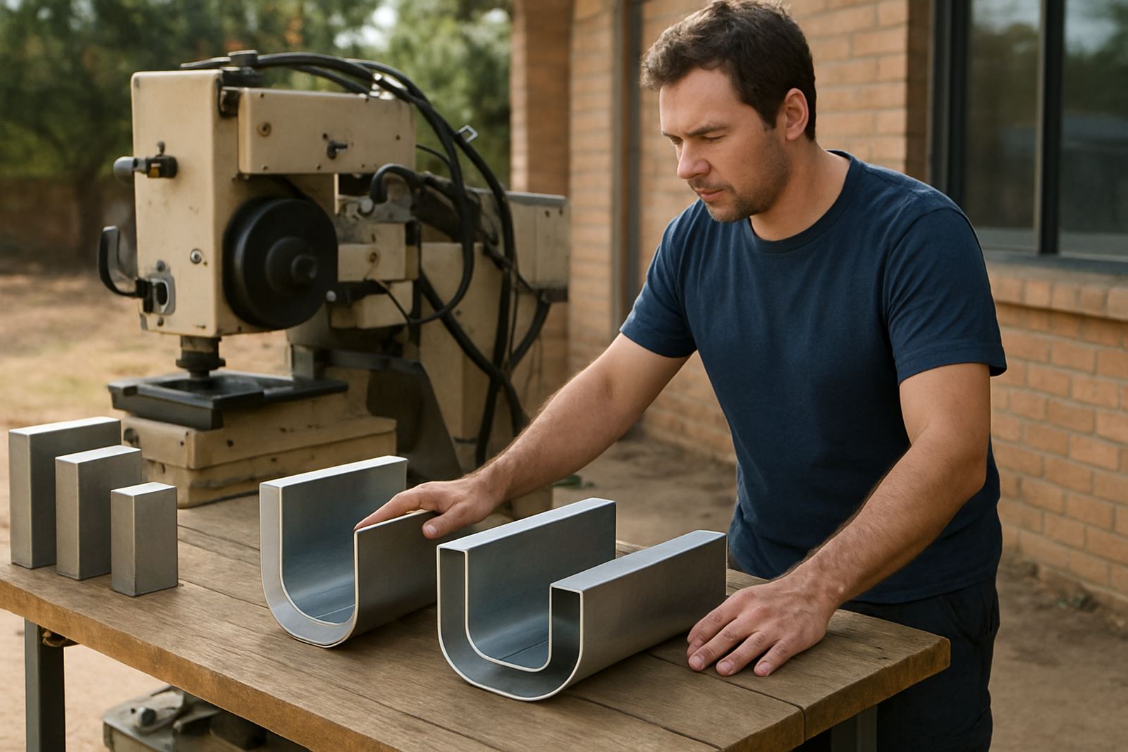
How return depth changes the look and strength of the sign
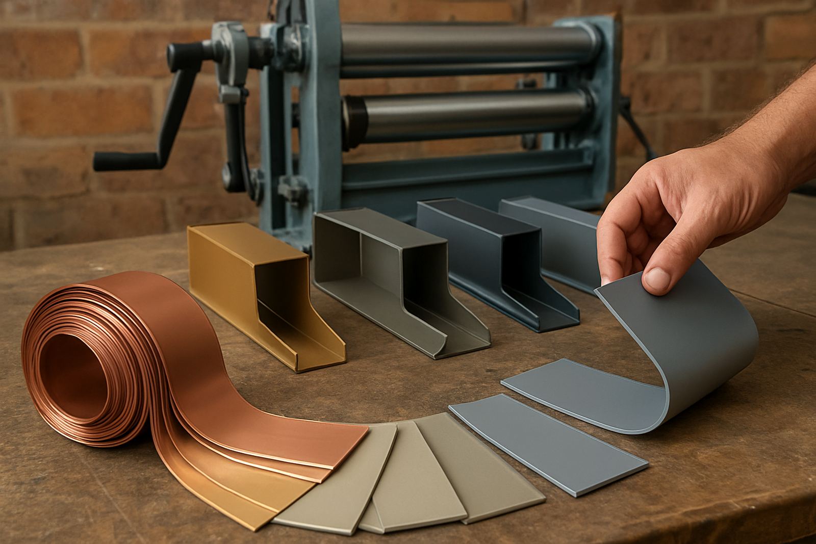
Return depth is the side wall of the letter, measured from the face back to the mounting surface. A shallow return gives a tighter, neater profile, while a deeper return creates more presence and space for internal components. In practice, the right depth must suit the letter height, the fixing method and the amount of light you want to carry through the face.
For small shopfront lettering, a shallower return can be enough if the sign is viewed close up and the face material is properly supported. For larger signs on pylons, roadside walls or tall façades, a deeper return often gives better visual weight and a more even result, especially when letters are exposed to strong sun or night-time lighting.
- Shallow returns suit compact letters and close viewing distances.
- Medium returns work well for most retail fascias and office signage.
- Deeper returns help with larger letters, stronger internal space and a bolder profile.
- Allow for fixing hardware, wiring routes and service access.
Choose depth by letter size and viewing distance
The first question is always where the sign will be read from. A reception wall viewed from a few metres away does not need the same depth as a roadside sign seen from across traffic lanes. As a rule, the smaller the letter and the closer the viewer, the less depth you need. Once the viewing distance increases, the letter can carry a deeper return without looking bulky.
For most sign makers in Gauteng and KZN, a good starting check is the face height, then the mounting surface, then the lighting method. On a windy site in Pretoria or an exposed coastal installation in Durban, a deeper return may need extra support to avoid flex. On a confined centre in Sandton, you may need to keep the depth controlled so the sign stays within landlord and municipal limits.
- Under 300 mm letters: check whether a slimmer profile will still allow service access.
- 300 mm to 600 mm letters: medium depth usually gives the best balance.
- Above 600 mm letters: consider deeper returns and extra fixing points.
- Always test the shape from the intended viewing distance before full production.
Match depth to lighting type and internal space
The return depth must suit the light source and the way the sign is built inside. If the depth is too shallow, you may struggle to fit wiring, modules or diffusion spacing without hot spots. If it is too deep, light can sit too far back and the face may appear dim or uneven, especially on smaller letters. The correct balance helps avoid callbacks after install and saves time during servicing.
Also think about heat and moisture. In humid areas, a little more internal breathing space can help reduce condensation. In load-shedding conditions, many clients use backup systems or timed controls, so the electrical layout should stay neat and easy to inspect. For busy production shops, a consistent return depth across a job also makes bending, assembly and spares handling simpler.
- Check that the depth suits the light source spacing and the face material.
- Leave enough room for cabling, joins and future repairs.
- Allow for drainage or moisture control on outdoor signs.
- Keep the internal layout tidy so fault-finding is quicker later on.
Site conditions in Midrand, coastal towns and busy commercial centres
South African sites vary a lot, so return depth should never be chosen from a stock rule only. In Midrand and across Gauteng, dust, roof heat and afternoon storms can affect how the sign sits and how often it needs attention. In coastal areas like Durban, salt in the air can shorten the life of exposed components if the depth is too tight and servicing is awkward. In Sandton, Pretoria, East Rand and West Rand business parks, body corporate rules may also influence how far a sign may project from the wall.
Ask what the site will face in real terms. Will the sign be viewed from a forecourt, street level or multi-storey parking area? Is it under shade or full sun? Is there safe access for a ladder, cherry picker or scaffold? A deeper return may look good on paper, but if the site makes maintenance difficult, a slightly shallower option can be the wiser choice.
- Check wind exposure, rain splash and sun direction.
- Confirm landlord, centre management or municipal projection limits.
- Allow for safe access for installation and later servicing.
- Use corrosion-aware materials where humidity or salt is a factor.
Simple workshop checklist before you set the depth
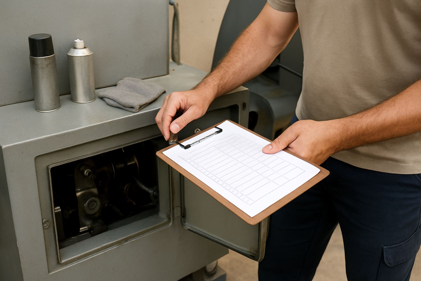
Before you bend the first return, work through a proper checklist with the customer and your production team. A few minutes here can prevent wasted coil, poor illumination and on-site adjustments that cost time. Keep the decision practical. The best depth is the one that fits the sign, the site and the budget without making the job harder than it needs to be.
If the client wants a premium finish, remind them that cleaner depth choices often come from better planning rather than simply going bigger. For mixed jobs with several letter sizes, keep the depth family consistent where you can, then change only where the scale really demands it. That makes the final sign look more orderly and keeps production moving.
- Measure letter height and note the viewing distance.
- Confirm indoor or outdoor use.
- Check the lighting method and electrical access.
- Review wind, weather and maintenance access.
- Confirm local rules and mounting limits before cutting material.
When to ask for technical help or a site check
There are times when the safest choice is to get a second opinion before production starts. Large fascias, multi-site rollouts, retrofit jobs and signs with tight installation tolerances all benefit from a proper check. If the return depth affects the structure, the wiring path or the way the sign will be fixed, it is worth slowing down and confirming the detail first.
Channel Letter supports sign makers with operator training, onsite commissioning, preventive servicing, breakdown support, spares supply, production coaching, material selection, remote tech help, installation planning and refresher training. From our Midrand base, we work with sign makers in Midrand, Sandton, Pretoria, East Rand, West Rand and Durban, with installs handled nationwide. For advice on a depth choice, send the spec through early and include the letter size, site photos and mounting notes.
- Send a message through our contact form with dimensions and site photos.
- Include the intended viewing distance and lighting type.
- Share any landlord or municipal restrictions before fabrication.
- Ask for help early if the job has tight tolerances or unusual fixing points.