
Start with the site, not the swatch
Before you settle on a colour finish, look at where the sign will live. A finish that works on an indoor reception wall may look too flat outside on a retail fascia, while a high-gloss face that reads well in Sandton can feel harsh on a heritage building in Pretoria. The right choice depends on viewing distance, lighting, dust, moisture and the kind of traffic passing the site every day.
At our Midrand base, we often see the same mistake: the colour is chosen from a sample under workshop lights, then the final sign lands on a street with full sun, reflected glass and passing cars. Once that happens, the finish can look lighter, darker or shinier than expected. That is why we always ask what the client wants the sign to do. Should it stand out from 30 metres away, or sit quietly and look clean up close?
- For outdoor retail and road-facing signs, aim for a finish with strong contrast and clear edge definition.
- For indoor branding, a softer finish often feels more controlled and less reflective.
- For coastal sites, consider how salt air and regular cleaning will affect the surface over time.
Gloss, matte or metallic: what each finish actually does
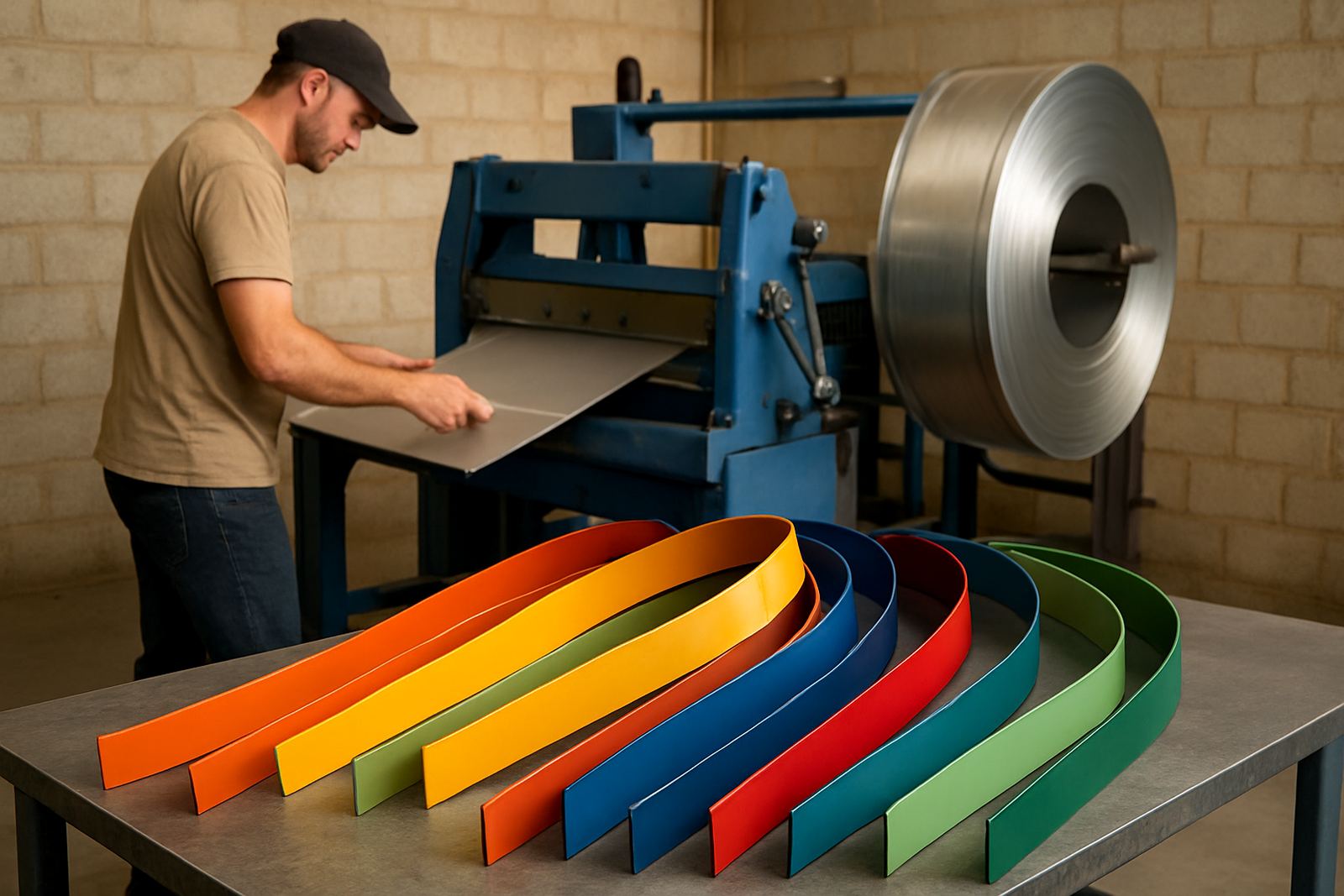
Gloss finishes give strong visual punch. They reflect light well, which makes them useful where a sign must catch attention quickly, especially at night under spotlights. The trade-off is that fingerprints, dust and installation marks show more easily. On smaller letters, gloss can also create hot spots in direct sun, which is worth noting for north-facing sites.
Matte finishes are calmer and easier to live with. They hide minor surface marks better and can suit corporate signs, clinics and office parks where the look needs to stay measured. Metallic finishes, including brushed or polished effects, bring depth and make lettering feel more engineered. They work well on premium signage but need careful handling because the grain direction and light reflection must be consistent across all parts.
- Gloss: best for visibility and bold retail impact.
- Matte: best for low glare, a cleaner long-term appearance and less obvious fingerprints.
- Metallic: best for premium presentations and signs that need texture or depth.
Durability matters more than trend
A finish should suit the environment first and the style second. In Durban humidity, a coating needs to cope with damp air, regular rain and occasional salt carry depending on the site. In the East Rand and West Rand, dust and industrial pollution can cling to textured surfaces and make them harder to maintain. In high-heat areas, darker colours absorb more sun and may show temperature stress sooner if the material choice is poor.
This is why finish choice and material choice must work together. A deep black gloss on the face may look sharp in the sample room, but if the return edges or backing are not suited to the exposure, the sign can start looking tired long before its time. Choosing finishes with maintenance in mind saves money, particularly for clients who do not want frequent call-outs or access equipment every few months.
For many projects, the best option is not the fanciest one. It is the one that still looks right after six months of dust, cleaning and sun.
Match the finish to the brand voice
Colour finish should support the brand, not fight it. A fast-food site may need bright, hard-working colour that reads from the car park. A law office or medical practice may prefer a restrained satin look that feels orderly and professional. A factory reception could use brushed metallic lettering to signal precision without becoming flashy.
Think about the feeling the client wants customers to have before they even step inside. Finish helps with that first impression. A warm copper tone can feel welcoming, while a cool silver finish often suggests technical work, engineering or modern corporate spaces. If the brand already uses bold colours, the surface finish should support that palette instead of competing with it.
- Clean, modern brands often suit satin or matte surfaces.
- Retail and entertainment sites often need stronger contrast and higher reflectivity.
- Technical and industrial clients usually prefer finishes that look tidy under bright light and are easy to maintain.
Local example: a Midrand retail frontage with mixed light
A good example comes from a retail frontage in Midrand where the sign faced morning sun, afternoon shade and heavy evening traffic. The client first asked for a polished finish because it looked striking in the sample. Once we looked at the site, though, it was clear that the reflection from nearby glass would make the letters hard to read at certain times of day. We changed the plan to a softer metallic finish with stronger contrast on the return edges.
That small change improved visibility without losing the premium feel. It also reduced the amount of visible dust, which mattered because the site sits close to a busy road. The client needed something that would stay presentable between scheduled cleans, not something that needed attention every week. That is the real point of colour finish choice: it should work for the site, the cleaning routine and the people who have to live with it.
On projects like this, we also plan installation around weather, access and power interruptions. If the site relies on evening work or testing after load shedding, the finish must still read properly under temporary lighting so there are no surprises on handover day.
Choosing with maintenance and production in mind
It is easy to focus only on how a finish looks on day one. But sign makers need to think further ahead. Will the finish be easy to touch up if a letter is damaged during transport? Can the surface tolerate regular cleaning products? Does the chosen colour hide minor handling marks during installation, or does it show every fingerprint from the first lift?
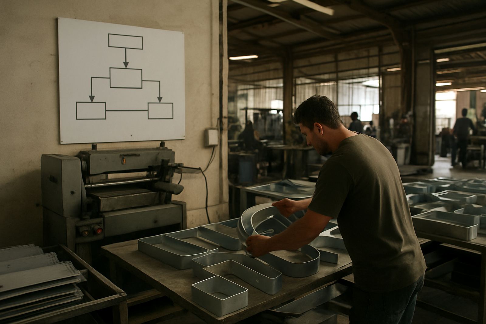
Production also matters. Some finishes are quicker to handle consistently across a full set of letters, while others need tighter control and more checks during fabrication. If a site has a large volume of faces or repeated sizes, a finish that behaves predictably can save time and reduce rework. That matters for suppliers, installers and the client.
- Ask how often the sign will be cleaned and by whom.
- Check whether the finish must match existing signage or new architectural elements.
- Consider spares and future repairs so replacements blend in properly.
A practical way to make the final call
The best colour finish choice usually comes from three questions. First, where will the sign be seen from and under what light? Second, how much upkeep is realistic for the client? Third, what mood should the sign create from a distance and close up? If you answer those clearly, the right finish becomes much easier to choose.
For sign makers, this is also where good training and proper commissioning help. A finish that looks perfect in the workshop can lose value if it is installed at the wrong angle, handled badly or paired with the wrong lighting. When the finish, fabrication and installation plan work together, the final result looks intentional and holds up in real conditions.
That is the goal for every project: a finish that suits the style, reduces maintenance pressure and still looks right after months of South African weather.