
Why return depth matters more than most people think
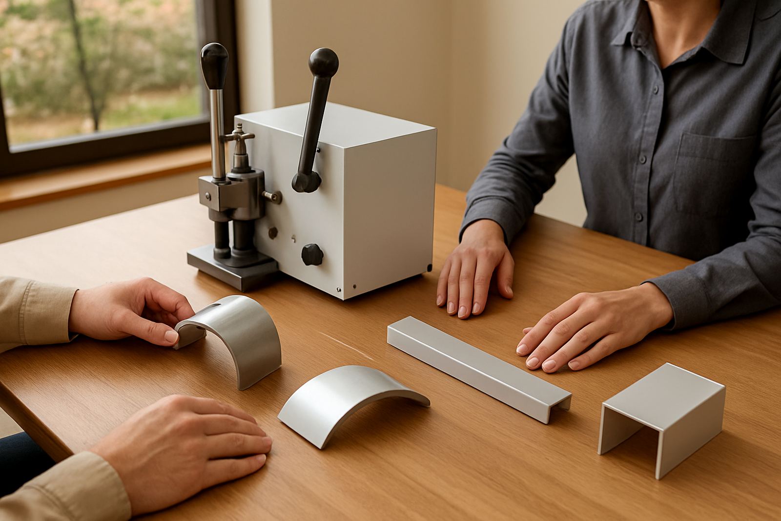
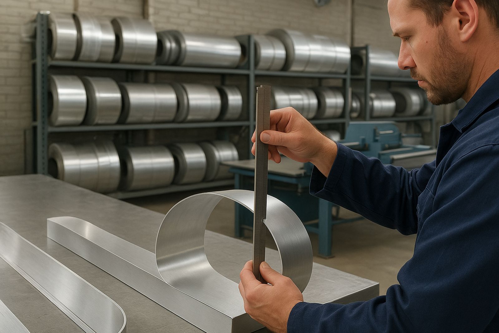
Return depth is the side wall height of a channel letter, and it changes the visual weight of the sign as much as the face size does. At a shopfront in Sandton or a forecourt in Pretoria, a 75 mm letter can read very differently from a 150 mm letter, even when the face area is the same. Depth also affects internal space for lighting, fixing strength and how neatly the letter sits against the mounting surface.
In practice, the right depth is the one that matches the viewing distance, the sign type and the way the letter will be built. A tight indoor feature wall near eye level needs a different approach from a roadside sign seen by traffic at 60 km/h. If the return is too shallow, you may fight hot spots from internal lighting and limited room for returns and wiring. If it is too deep, the sign can become heavy, bulky and more costly to fabricate.
Match depth to viewing distance and reading speed
A useful rule is simple: the further away people are, the more depth and face size you usually need to keep the sign legible. A pedestrian sign outside a café in Morningside may only need modest depth because people stand close and read slowly. A sign for a warehouse on a main road near the East Rand needs enough depth to hold its shape and still be read by motorists moving past quickly.
- Close viewing, such as reception walls or mall corridors: shallower returns often work well.
- Mid-range viewing, such as shopfronts across a parking area: medium depth is usually a practical balance.
- Longer viewing, such as roadside or industrial sites: deeper returns often help with presence and legibility.
- Fast-moving traffic: prioritise stronger depth, cleaner face layout and simple lettering.
The key is not to chase depth for its own sake. The letter has to be read in a second or two, not admired in a showroom. That is why the stroke width, font style and spacing between letters should be checked together with the return depth.
Choose depth for the site, not just the drawing
Site context changes the decision. Coastal humidity in Durban can affect materials and fixings, so a letter that is too shallow may not allow enough room for practical sealing and cable management. On an exposed facade in Midrand, wind loading can make a deeper, better-braced letter a safer choice. On older buildings, uneven plaster or cladding can also affect how much stand-off and depth you should allow.
Planning matters before any bending starts. Measure the wall, confirm the mounting surface, check access for a lift or scaffold, and make sure the electrical route is sensible. If the sign must sit above a lintel, canopy or decorative trim, the return depth can influence how the finished letter projects and how shadow lines fall across the wall. In some municipal areas, the final projection may also need to stay within approval limits, so it pays to check early.
- Allow for wall irregularities and fixing points.
- Check whether wind exposure will affect the return profile.
- Confirm that the depth will suit the lighting method used.
- Factor in service access for future maintenance and repairs.
Lighting type changes the depth you should choose
The lighting method is one of the biggest drivers of return depth. Front-lit letters need enough internal volume to distribute light evenly across the face. A letter with a very shallow return can show uneven brightness or dark patches, especially where the strokes are wide or the design has tight corners. For back-lit or halo-lit letters, the depth affects the shadow gap behind the letter and the clarity of the halo effect.
If the letter is unlit, you still need enough depth for structural strength, clean edging and a neat finish. For mixed signs, where some elements are lit and others are not, the depth should be planned as a set rather than one letter at a time. That keeps the whole sign visually consistent. It also makes installation faster and reduces surprises on site when the sign is mounted and powered up for the first time.
Common depth ranges and when they make sense
There is no single depth that works for every job, but a few practical ranges appear often in South African sign work. The material choice, letter height and fixing method all matter, yet the ranges below give a useful starting point for planning and pricing.
- 50 mm to 75 mm: often used for smaller indoor letters, feature walls or tight architectural spaces.
- 100 mm to 125 mm: a common middle range for shopfronts, offices and many light commercial signs.
- 150 mm and above: useful for larger letters, exposed sites, stronger presence and certain illuminated applications.
Smaller letters can sometimes need deeper returns than you expect because the components still have to fit inside the body. Larger letters may not need extreme depth if the design is simple and the sign is close to the viewer. The best result usually comes from balancing the letter height, the face material, the viewing distance and the installation surface together, not in isolation.
A local example from Midrand to the Highveld
Consider a sign for a business park in Midrand with visitors arriving by car and walking from the parking area. The letters need to be visible in daylight, but the site also gets dust, heat and strong afternoon sun. A moderate return depth can give enough presence without making the sign look heavy against a modern facade. If the same brand later opens a branch in Pretoria with a wider frontage and more direct road visibility, the depth and letter size may need to change to suit the longer viewing distance.
That is why good depth selection starts with a site walk or at least a proper briefing. A signmaker should look at approach angle, mounting height, power access and any weather exposure before finalising the build. If the sign is going into a coastal branch in Durban, or a windy freestanding wall in the West Rand, the practical detail often matters more than the catalogue size. A well chosen depth saves time, reduces rework and makes the finished sign easier to maintain over the years.
The short checklist before you place the order
Before you commit to production, test the return depth against the real job and not only the artwork. Ask how far away the sign will be seen, whether it is lit, what it will be mounted onto, and whether the site has wind, moisture or access challenges. If the answer to any of those points is unclear, it is better to pause and measure properly than to rush the build and hope for the best.
- Confirm the main viewing distance.
- Check if the sign is front-lit, back-lit or unlit.
- Measure the available mounting space and any projection limits.
- Review site conditions such as humidity, wind and dust.
- Plan for servicing, cable access and future replacement parts.
For sign makers, depth selection is not only a fabrication choice, it is part of the job specification. Get it right and the sign reads cleanly, holds its form and installs with less fuss. Get it wrong and even a well-made letter can look out of place.